Wonderlab
Branding & Salon Design
There are moments in life that make us stop and stare, make jaws drop, eyes open and heads turn. Wonderlab aims to create looks that provide those moments. When clients come to its chairs, the aim is to create that spark of wonder.
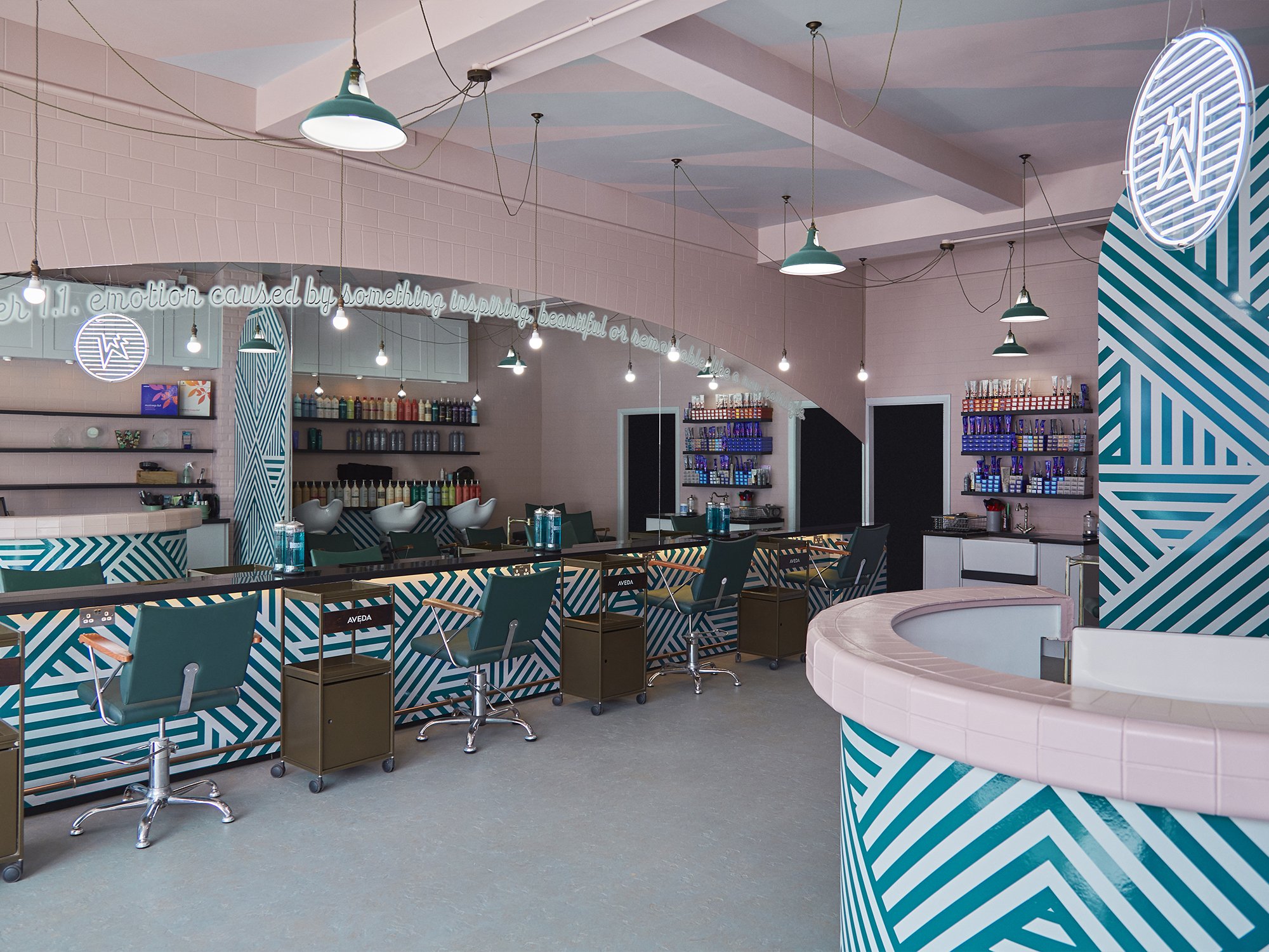
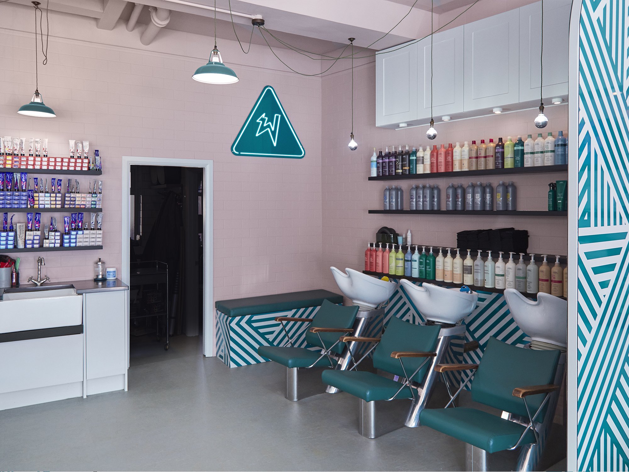
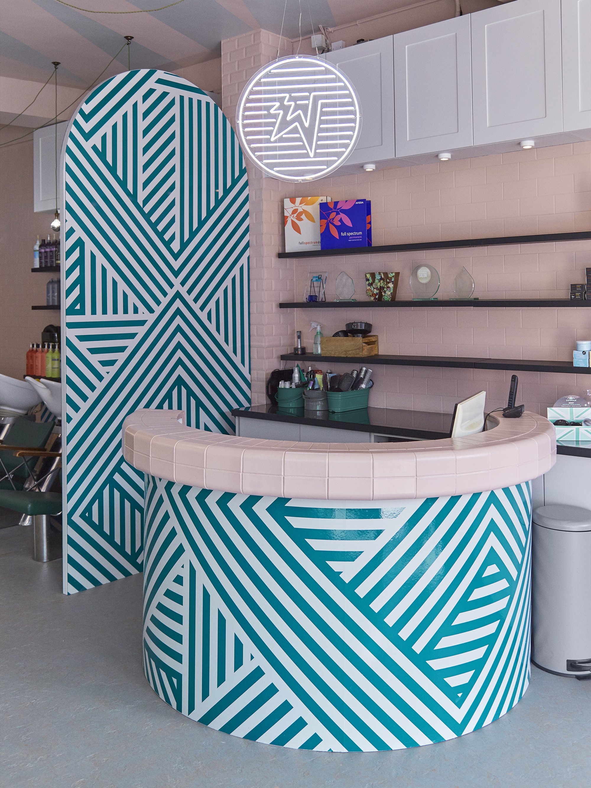
The design of the salon takes inspiration from a Korean-kitsch aesthetic, resulting in a branded space that’s bold, fun, playful and positively charged. This eastern influence is complimented by a petrol and salmon palette, grounded by cement greys and illuminated by neon lighting.
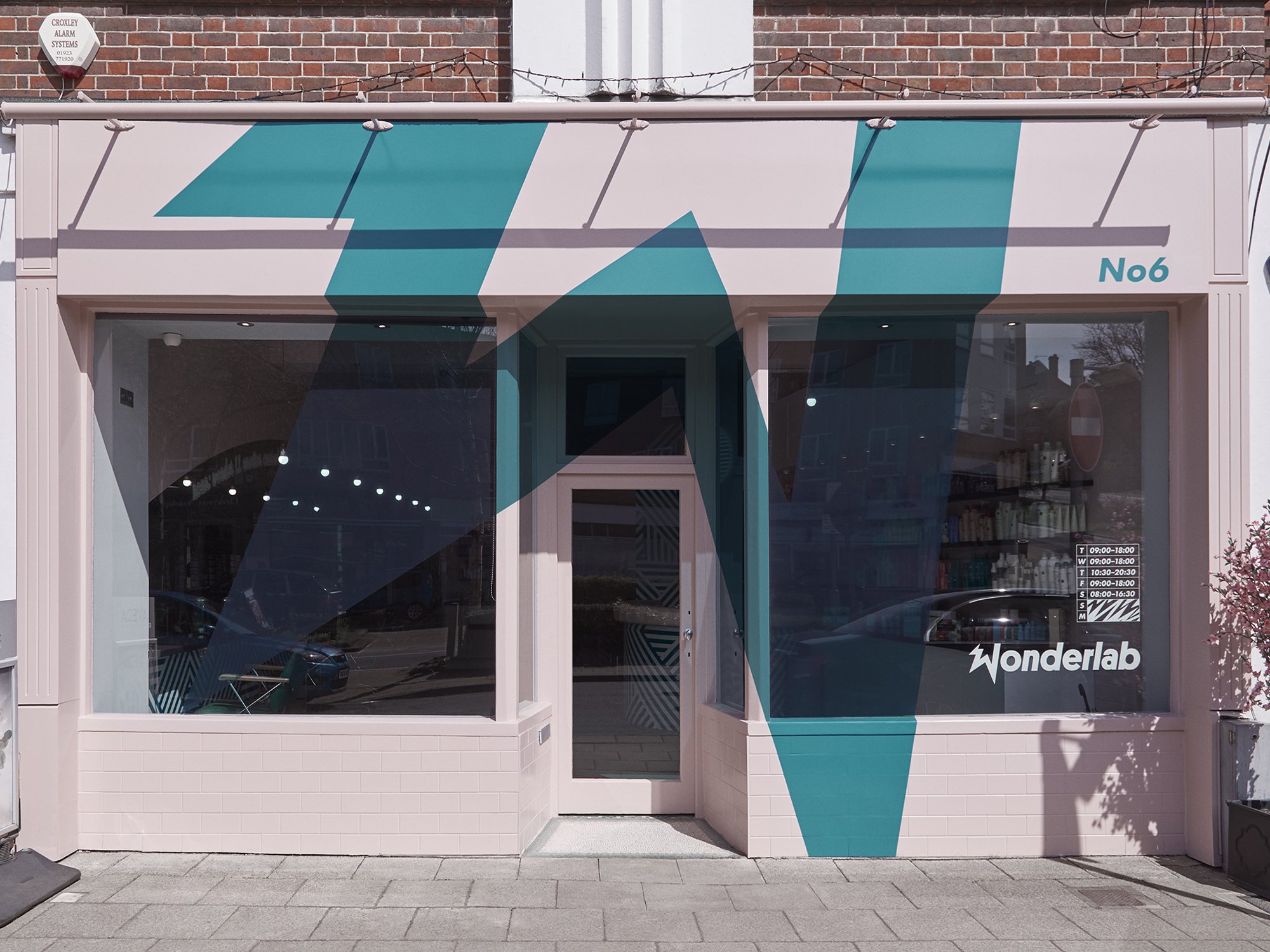
Instead of a traditional fascia sign, a giant W zig-zags across the entire storefront and large graphic patterns carry this energy across the store environment.
Designed at: ROAR Creativity


